How I Designed a Map
A tale that spans 1600 days and 3300 KMs
 The Holy Trinity
It was January of 2016. I was trying to figure out where I would head to next. I had a bucket list and at the top of that list was The Holy Trinity - Ladakh, New Zealand, Iceland.
My last trip, 14 months ago, was to New Zealand. The minute I saw Peter Jackson’s Lord of the Rings was the exact moment it got added to my list. LOTR was one of my favourite books, and to now have an actual physical location where I could pretend to be in Middle Earth, was too good of an opportunity to pass up.
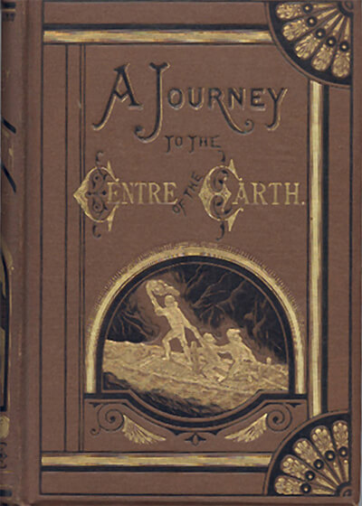
However, Iceland got added very early in my life. When I was 6, I read Jules Verne’s “A Journey to the Center of the Earth” in which the titular journey starts at Snæfellsjökull in Iceland. I opened my atlas that evening to check if it was a real country and where it was. When, a couple of years later, I found out about Aurora Borealis and how they’d be visible from anywhere in Iceland, it became a part of the Holy Trinity. All I had to do was wait and gather some money.
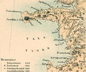
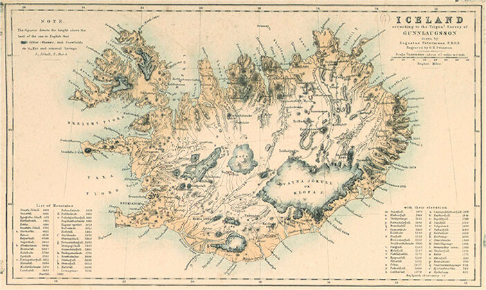
Back to 2016. It was now final that we would be visiting Iceland that year. I did all my research on the gear we’d need, the best time to go, and it was deemed that September was the perfect month. The problem was that it was 8 months away. I had read everything I could about Iceland and didn’t want to see too many photos of it since those could act as a spoiler, so I did the only logical thing I could do. I decided to design a map of Iceland. From scratch.
The Vision
Now, while I absolutely adored maps and spent time collecting them, I had NO idea how to design one. How hard could it be? I’m a designer, I should be able to do this. Turns out, it’s bloody difficult. Just when things seemed bleak, I remembered Mapbox. They provided maps for a lot of apps so maybe I could use it to customise my own?
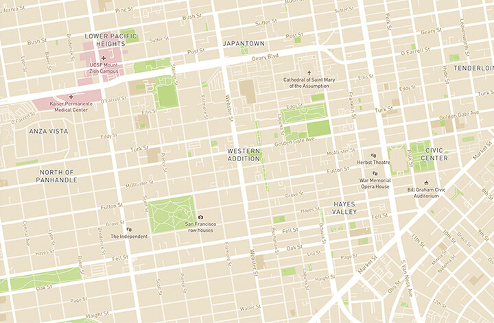
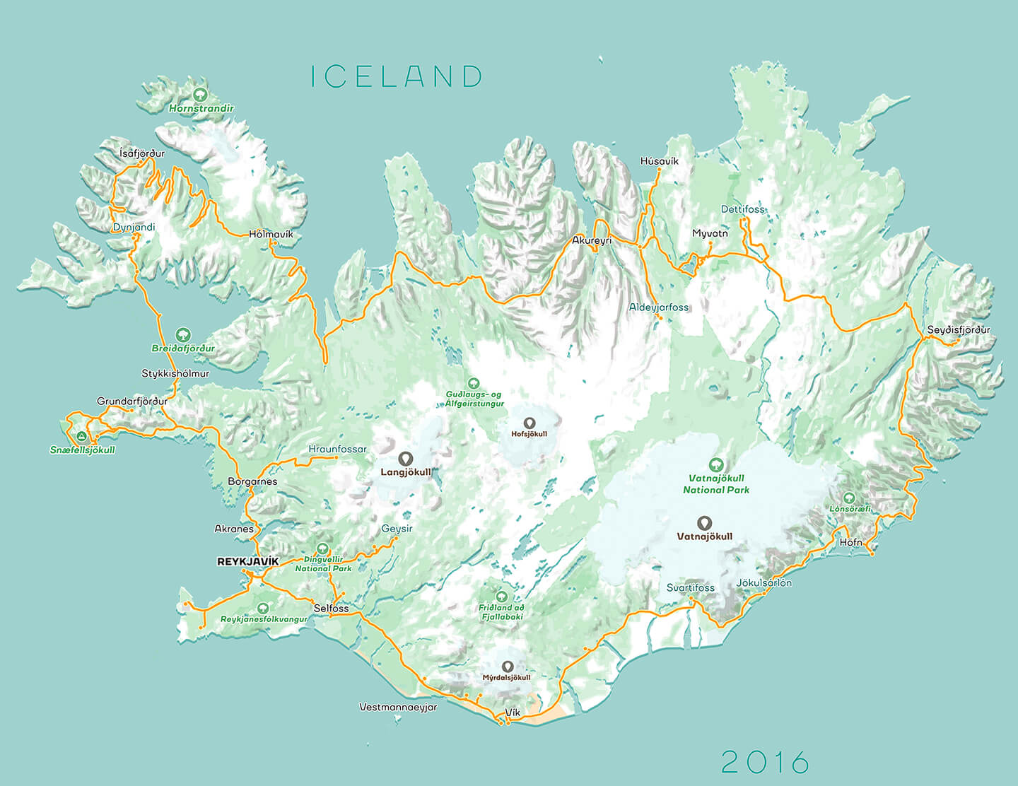
My vision was to custom design a map of Iceland on which I would then chart my road trip. Maybe I’d frame it and put it on the wall to reminisce.
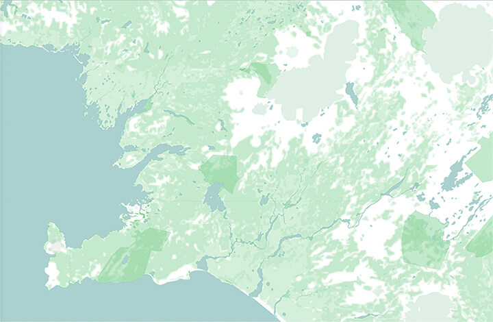
I did some research and found that Mapbox allowed me to choose tile sets, select geodata and then style them. Bingo! On my way home I started thinking about the map, and zeroed in on the colours I wanted to use. White and green. Ice and land. Simple enough.
The white wouldn’t be a diluted version though. Iceland is a relatively young country (20 million years) and that lends itself to rugged, stark terrain and hence I chose the starkest white. For everything else, I’d use a soft colour palette.
Quick aside - Greenland in reality has more ice then Iceland, and Iceland is greener than Greenland but we'll let that slip for now.
When I got home and opened Mapbox, I realised that I had forgotten one HUGE thing in my naivety. They were a map/data provider. Which means this was a map that you could zoom in and out of, enabling anyone to customise any detail at different zoom levels. My mind was blown at the endless possibilities. Somewhere at the back of my head a voice also said “have I taken on too much?”. But then I remembered I had 8 months to kill and happily dove in.
I studied it for about a 10-15 days. I looked at all possible data they provided, how I could filter and change data. They also had a few themes which I sat and dissected and saw how colours, fonts, and sizes changed as you zoomed in and out. Once I was done with that, I was ready to start designing my map.
The Colors
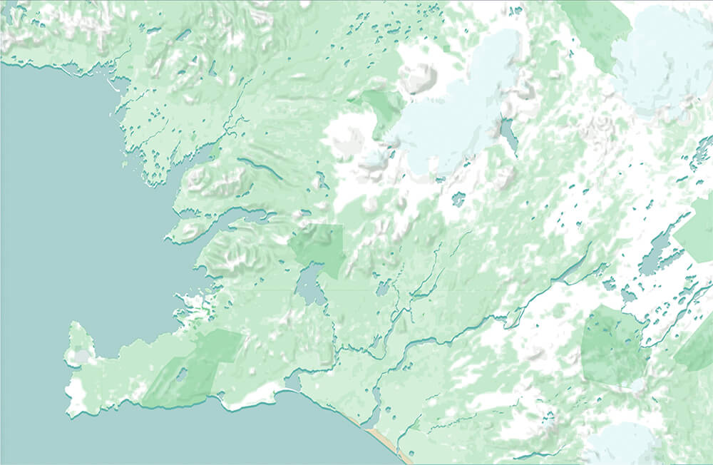
I sat down and made a rough palette. For all landcover, I chose the same green at different opacities so that when they overlapped, it would create visual layers.
The Typography
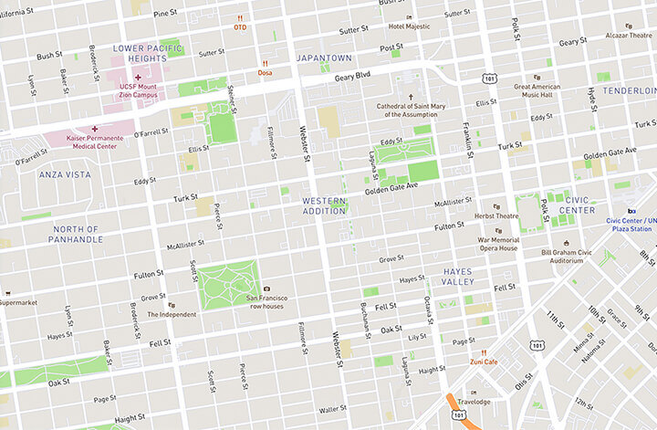
The map was coming along well but I wanted a better font. In the novel, it all starts with a cryptic note written in the Runic script. I wanted something similar - hard edges, geometrical lines harkening back to the Nordic style.
After a long time looking for it, I found TT Firs - designed by Ivan Gladkikh and the TypeType team. It was perfect. It came in a huge range of variants, was neutral, and most importantly, legible at smaller sizes. It gave a beautiful character to my map.
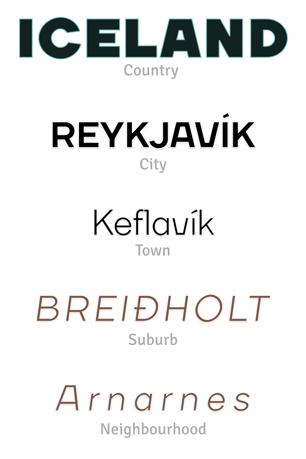
It was now time to style POIs. I grouped them by type and assigned colours. Green for nature, purple for transport, teal for water-based transport, red for medical, and orange for education. Everything else would be brown. Groups would have similar colours but different icons. Fortunately, Mapbox had a whole set of POI icons ready to be used and customised.
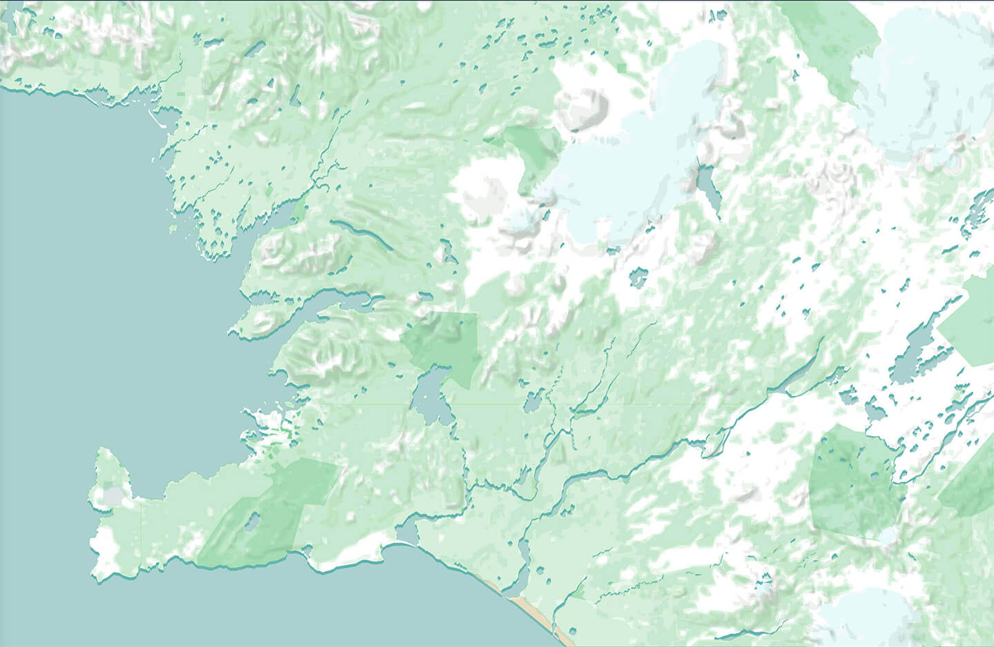
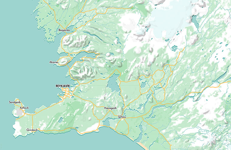
The map was coming along beautifully. There were a few niggles here and there but V1 of my map was complete! The niggles were mainly at higher zoom levels with roads but since my final aim was to map my whole road trip on this design, I figured it was okay if I left it at that. The map was designed only for Iceland so the colours and information density wouldn’t work on all countries. The V1 of my map can be seen below and you’re free to explore and play around with it. It was now May 2016 and I couldn’t plot the road trip until I was back.
Dusting it Off
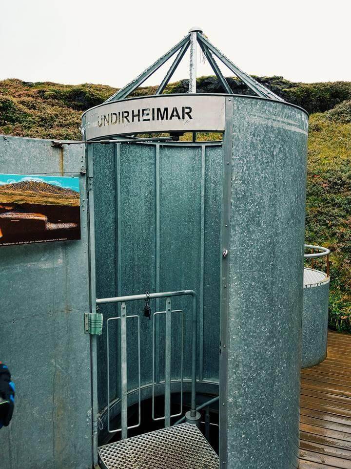
4 months later I went on my trip. I spent 16 days in Iceland driving 3300kms taking it all in. I hiked random trails, saw stunning waterfalls, and experienced standing under the Aurora until my fingers went numb with the cold. It was a surreal experience.
However, I forgot about the map I’d made. Flash forward 4 years. Lockdown happened and I remembered my map. I came back and saw that there was a new version of Mapbox which let me do in 30 minutes what took me weeks. (insert laugh crying GIF).
While I was writing this post, Mapbox released another updated version! Do they even sleep?
I estimated it would take me even more time to learn the new version and transfer my styles there so I stuck with the old one. All I had to do now was chart my trip onto the map. To be able to do that I had to map out my whole trip and every single place I went to and then learn how to use Mapbox APIs to then overlay it on top of my map. Thankfully I remembered my route almost completely.
Once I had my trip details, I learnt how GeoJSON works and used that to make a tileset in Mapbox which I could then style. It’s actually pretty simple once you know what to do but it took me almost a week to figure all of it out. I tried it on my New Zealand map once and then ported it onto Iceland. All of it finally clicked into place.
Almost 1600 days after I first began, my map was finally complete. I exported the map, made some adjustments in Photoshop to make a final static version of my road trip to Iceland - which by the way, included going to Snæfellsjökull where it all started.